Practical Two: Species Distribution Modelling#
Required packages#
There are many R packages available for species distribution modelling. If you search through the CRAN package index for ‘species distribution’, you will find over 20 different packages that do something - and that is only using a single search term.
We are going to concentrate on the dismo package: it is a little old but provides a
single framework to handle different model types. It also has an excellent vignette
(a detailed tutorial on how to use the package) for further details:
https://cran.r-project.org/web/packages/dismo/vignettes/sdm.pdf
One thing to note is that dismo is still built around the older raster package and
expects inputs to be as Raster objects from that package. You will see this code used
below to convert a terra::SpatRaster object to raster::Raster object:
raster_obj <- as(spat_raster_obj, 'Raster')
We will need to load the following packages. Remember to read this guide on setting up packages on your computer before running these practicals on your own machine.
To load the packages:
library(terra)
library(geodata)

library(raster)
library(sf)
library(sp)

library(dismo)
Introduction#
This practical gives a basic introduction to species distribution modelling using R. We will be using R to characterise a selected species environmental requirements under present day climatic conditions and then projecting the availability of suitable climatic conditions into the future. This information will then be used to analyse projected range changes due to climate change. During this process we will analyse the performance of species distribution models and the impacts of threshold choice, variable selection and data availability on model quality.
Data preparation#
There are two main inputs to a species distribution model. The first is a set of points describing locations in which the species is known to be found. The second is a set of environmental raster layers – these are the variables that will be used to characterise the species’ environmental niche by looking at the environmental values where the species is found.
Focal species distribution#
We will be using the Mountain Tapir (Tapirus pinchaque) as an example species.
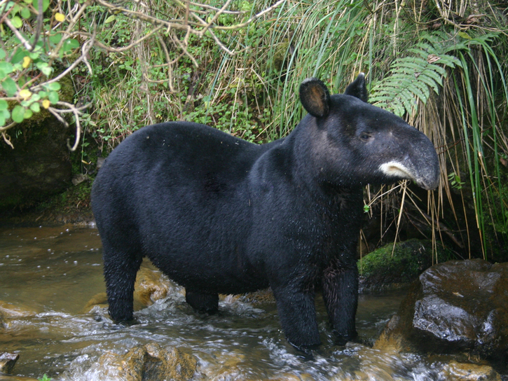
Tapirus pinchaque. © Diego Lizcano
I have picked this because it has a fairly narrow distribution but also because there is reasonable data in two distribution data sources:
The IUCN Red List database: Mountain Tapir, which is a good source of polygon species ranges. These ranges are usually expert drawn maps: interpretations of sighting data and local information.
The GBIF database: Mountain Tapir, which is a source of point observations of species.
It is hugely important to be critical of point observation data and carefully clean it.
There is a great description of this process in the dismo vignette on species
distribution modelling:
vignette('sdm')
There are many other issues that creep into GBIF data, so if you end up using GBIF data in research, you should also look at the CoordinateCleaner package, which provides a huge range of checks on coordinate data.
We can view both kinds of data for this species.
The IUCN data is a single MULTIPOLYGON feature showing the discontinuous sections of the species’ range. There are a number of feature attributes, described in detail in this pdf.
tapir_IUCN <- st_read('data/sdm/iucn_mountain_tapir/data_0.shp')
print(tapir_IUCN)
Reading layer `data_0' from data source
  `/Users/dorme/Teaching/GIS/Masters_GIS_2020/practicals/practical_data/sdm/iucn_mountain_tapir/data_0.shp'
  using driver `ESRI Shapefile'
Simple feature collection with 1 feature and 15 fields
Geometry type: MULTIPOLYGON
Dimension:     XY
Bounding box:  xmin: -79.62289 ymin: -5.962554 xmax: -73.82314 ymax: 5.031971
Geodetic CRS:  WGS 84
Simple feature collection with 1 feature and 15 fields
Geometry type: MULTIPOLYGON
Dimension:     XY
Bounding box:  xmin: -79.62289 ymin: -5.962554 xmax: -73.82314 ymax: 5.031971
Geodetic CRS:  WGS 84
  ASSESSMENT ID_NO          BINOMIAL PRESENCE ORIGIN SEASONAL COMPILER YEAR
1   45173922 21473 Tapirus pinchaque        1      1        1     IUCN 2008
                                               CITATION            LEGEND
1 IUCN (International Union for Conservation of Nature) Extant (resident)
  SUBSPECIES SUBPOP DIST_COMM ISLAND TAX_COMM                       geometry
1       <NA>   <NA>      <NA>   <NA>     <NA> MULTIPOLYGON (((-78.00009 0...
The GBIF data is a table of observations, some of which include coordinates. One thing that GBIF does is to publish a DOI for every download, to make it easy to track particular data use. This one is https://doi.org/10.15468/dl.t2bkzx.
There are some tricks to loading the GBIF data:
Although GBIF use the file
.csvsuffix, the file is in fact tab delimited so we need to useread.delim().We also need to remove rows with no coordinates.
# Load the data frame
tapir_GBIF <- read.delim('data/sdm/gbif_mountain_tapir.csv')

# Drop rows with missing coordinates
tapir_GBIF <- subset(tapir_GBIF, ! is.na(decimalLatitude) | ! is.na(decimalLongitude))

# Convert to an sf object and set the projection
tapir_GBIF <- st_as_sf(tapir_GBIF, coords=c('decimalLongitude', 'decimalLatitude'))
st_crs(tapir_GBIF) <- 4326
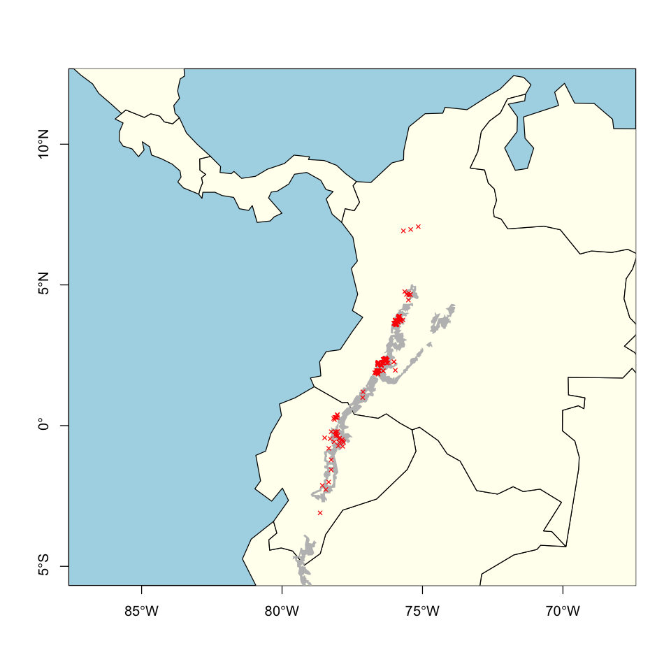
We can now superimpose the two datasets to show they broadly agree. There aren’t any obvious problems that require data cleaning.
# Load some (coarse) country background data
ne110 <- st_read('data/ne_110m_admin_0_countries/ne_110m_admin_0_countries.shp')
Reading layer `ne_110m_admin_0_countries' from data source
  `/Users/dorme/Teaching/GIS/Masters_GIS_2020/practicals/practical_data/ne_110m_admin_0_countries/ne_110m_admin_0_countries.shp'
  using driver `ESRI Shapefile'
Simple feature collection with 177 features and 168 fields
Geometry type: MULTIPOLYGON
Dimension:     XY
Bounding box:  xmin: -180 ymin: -90 xmax: 180 ymax: 83.64513
Geodetic CRS:  WGS 84
# Create a modelling extent for plotting and cropping the global data.
model_extent <- extent(c(-85,-70,-5,12))

# Plot the species data over a basemap
plot(st_geometry(ne110), xlim=model_extent[1:2], ylim=model_extent[3:4],
     bg='lightblue', col='ivory', axes=TRUE)
plot(st_geometry(tapir_IUCN), add=TRUE, col='grey', border=NA)
plot(st_geometry(tapir_GBIF), add=TRUE, col='red', pch=4, cex=0.6)
Predictor variables#
Several sources of different environmental data were mentioned in the lecture, but in this practical we will be using climatic variables to describe the environment. In particular, we will be using the BIOCLIM variables. These are based on simple temperature and precipitation values, but in 19 combinations that are thought to capture more biologically relevant aspects of the climate. These variables are described here:
https://www.worldclim.org/data/bioclim.html
The data we will use here have already been downloaded using the
geodata::worldclim_global and geodata::cmip6_world functions. If you are using your
own computer, this code will fetch the data first. The two datasets loaded contain
averages across two time periods:
historical climate data (1970 - 2000), and
projected future climate (2041 - 2060) taken from the Hadley GEM3 model using the SSP5-8.5 Shared Socioeconomic Pathway.
Both these datasets are sourced from http://www.worldclim.org and contain a stack of the 19 BIOCLIM variables at 10 arc-minute resolution (\(10' = \dfrac{1}{6}° \approx 15\, \text{km}\)).
# Load the data
bioclim_hist <- worldclim_global(var='bio', res=10, path='data')
bioclim_future <- cmip6_world(var='bioc', res=10, ssp="585",
                             model='HadGEM3-GC31-LL', time="2041-2060", path='data')

# Relabel the variables to match between the two dataset
bioclim_names <- paste0('bio', 1:19)
names(bioclim_future) <- bioclim_names
names(bioclim_hist) <- bioclim_names

# Look at the data structure
print(bioclim_hist)
class       : SpatRaster
dimensions  : 1080, 2160, 19  (nrow, ncol, nlyr)
resolution  : 0.1666667, 0.1666667  (x, y)
extent      : -180, 180, -90, 90  (xmin, xmax, ymin, ymax)
coord. ref. : lon/lat WGS 84 (EPSG:4326)
sources     : wc2.1_10m_bio_1.tif
              wc2.1_10m_bio_2.tif
              wc2.1_10m_bio_3.tif
              ... and 16 more source(s)
names       :      bio1,     bio2,       bio3,     bio4,      bio5,      bio6, ...
min values  : -54.72435,  1.00000,   9.131122,    0.000, -29.68600, -72.50025, ...
max values  :  30.98764, 21.14754, 100.000000, 2363.846,  48.08275,  26.30000, ...
print(bioclim_future)
class       : SpatRaster
dimensions  : 1080, 2160, 19  (nrow, ncol, nlyr)
resolution  : 0.1666667, 0.1666667  (x, y)
extent      : -180, 180, -90, 90  (xmin, xmax, ymin, ymax)
coord. ref. : lon/lat WGS 84 (EPSG:4326)
source      : wc2.1_10m_bioc_HadGEM3-GC31-LL_ssp585_2041-2060.tif
names       :  bio1, bio2,  bio3,   bio4,  bio5,  bio6, ...
min values  : -51.9, -1.7, -16.7,   13.9, -27.3, -69.8, ...
max values  :  34.3, 21.0,  94.8, 2338.2,  52.5,  27.1, ...
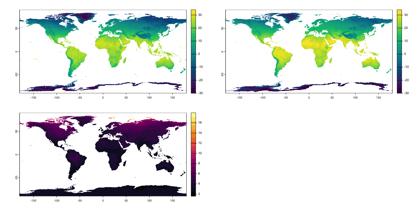
We can compare BIO 1 (Mean Annual Temperature) between the two datasets:
par(mfrow=c(2,2), mar=c(1,1,1,1))

# Create a shared colour scheme
breaks <- seq(-30, 35, by=2)
cols <- hcl.colors(length(breaks) - 1)

# Plot the historical and projected data
plot(bioclim_hist[[1]], breaks=breaks, col=cols,
     type='continuous', plg=list(ext=c(190,200,-90,90)))
plot(bioclim_future[[1]], breaks=breaks, col=cols,
     type='continuous', plg=list(ext=c(190,200,-90,90)))

# Plot the temperature difference
plot(bioclim_future[[1]] - bioclim_hist[[1]],
     col=hcl.colors(20, palette='Inferno'), breakby='cases',
     type='continuous', plg=list(ext=c(190,200,-90,90)))
We are immediately going to crop the environmental data down to a sensible modelling region. What counts as sensible here is very hard to define and you may end up changing it when you see model outputs, but here we use a small spatial subset to make things run quickly.
# Reduce the global maps down to the species' range
bioclim_hist_local <- crop(bioclim_hist, model_extent)
bioclim_future_local <- crop(bioclim_future, model_extent)
Reproject the data#
All of our data so far has been in the WGS84 geographic coordinate system. We now need to reproject the data into an appropriate projected coordinate system: the Universal Transverse Mercator Zone 18S is a good choice for this region.
For the raster data, if we just specify the projection, then the terra package picks a
resolution and extent that best approximates the original data.
test <-  project(bioclim_hist_local, 'EPSG:32718')
ext(test)
SpatExtent : -618479.596609369, 1065045.31979816, 9441019.82660742, 11346548.0286951 (xmin, xmax, ymin, ymax)
res(test) # Resolution in metres on X and Y axes
- 18500.2738066762
- 18500.2738066762
There isn’t anything really wrong with that, but having round numbers for the grid extent and resolution is a bit easier to describe and work with. We can create the specific grid we want and project the data into that.
# Define a new projected grid
 utm18s_grid <- rast(ext(-720000, 1180000, 9340000, 11460000),
                       res=20000, crs='EPSG:32718')

# Reproject the model data
bioclim_hist_local <- project(bioclim_hist_local, utm18s_grid)
bioclim_future_local <- project(bioclim_future_local, utm18s_grid)
Now we can also reproject the species distribution vector data:
tapir_IUCN <- st_transform(tapir_IUCN, crs='EPSG:32718')
tapir_GBIF <- st_transform(tapir_GBIF, crs='EPSG:32718')
Pseudo-absence data#
Many of the methods below require absence data, either for fitting a model or for evaluating the model performance. Rarely, we might actually have real absence data from exhaustive surveys, but usually we only have presence data. So, modelling commonly uses pseudo-absence or background locations. The difference between those two terms is subtle: I haven’t seen a clean definition but background data might be sampled completely at random, where pseudo-absence makes some attempt to pick locations that are somehow separated from presence observations.
The dismo package provides the randomPoints function to select background data. It
is useful because it works directly with the environmental layers to pick points
representing cells. This avoids getting duplicate points in the same cells. You do
need to provide a mask layer that shows which cells are valid choices. You can also
exclude cells that contain observed locations by setting p to use the coordinates of
your observed locations.
# Create a simple land mask
land <- bioclim_hist_local[[1]] >= 0

# How many points to create? We'll use the same as number of observations
n_pseudo <- nrow(tapir_GBIF)

# Sample the points
pseudo_dismo <- randomPoints(mask=as(land, 'Raster'), n=n_pseudo,
                             p=st_coordinates(tapir_GBIF))

# Convert this data into an sf object, for consistency with the
# next example.
pseudo_dismo <- st_as_sf(data.frame(pseudo_dismo), coords=c('x','y'), crs=32718)
We can also use GIS to do something a little more sophisticated. This isn’t necessarily the best choice here, but is an example of how to do something more structured. The aim here is to pick points that are within 100 km of observed points, but not closer than 20km. The units of the projection is metres, so we multiply by 1000.
# Create buffers around the observed points
nearby <- st_buffer(tapir_GBIF, dist=100000)
too_close <- st_buffer(tapir_GBIF, dist=20000)
# merge those buffers
nearby <- st_union(nearby)
too_close <- st_union(too_close)
# Find the area that is nearby but _not_ too close
nearby <- st_difference(nearby, too_close)
# Get some points within that feature in an sf dataframe
pseudo_nearby <- st_as_sf(st_sample(nearby, n_pseudo))
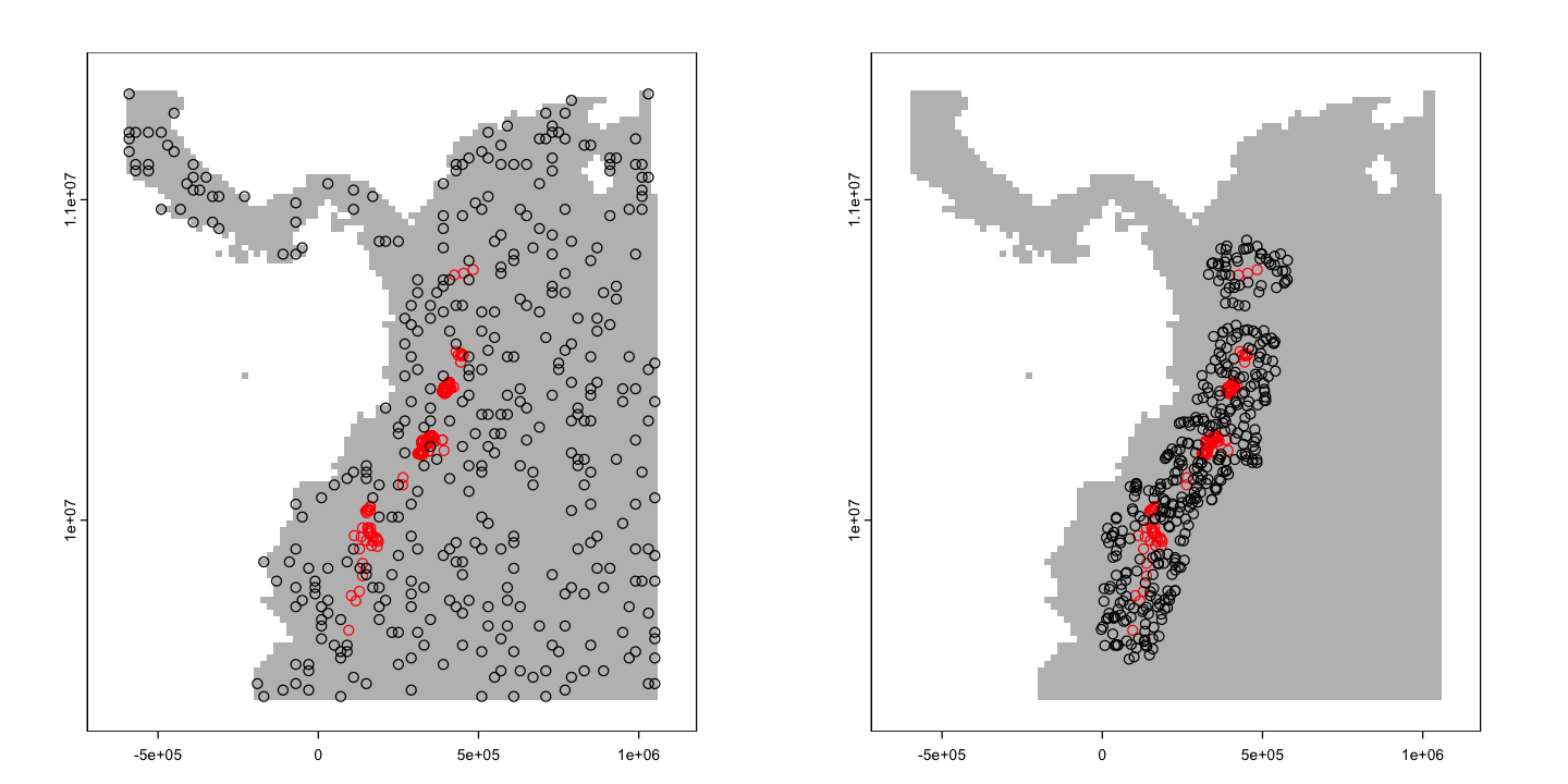
We can plot those two points side by side for comparison.
par(mfrow=c(1,2), mar=c(1,1,1,1))

# Random points on land
plot(land, col='grey', legend=FALSE)
plot(st_geometry(tapir_GBIF), add=TRUE, col='red')
plot(pseudo_dismo, add=TRUE)

# Random points within ~ 100 km but not closer than ~ 20 km
plot(land, col='grey', legend=FALSE)
plot(st_geometry(tapir_GBIF), add=TRUE, col='red')
plot(pseudo_nearby, add=TRUE)
A really useful starting point for further detail on pseudo absences is the following study:
Barbet‐Massin, M., Jiguet, F., Albert, C.H. and Thuiller, W. (2012), Selecting pseudo‐absences for species distribution models: how, where and how many?. Methods in Ecology and Evolution, 3: 327-338. doi:10.1111/j.2041-210X.2011.00172.x
Testing and training dataset#
One important part of the modelling process is to keep separate data for training the model (the process of fitting the model to data) and for testing the model (the process of checking model performance). Here we will use a 20:80 split - retaining 20% of the data for testing.
# Use kfold to add labels to the data, splitting it into 5 parts
tapir_GBIF$kfold <- kfold(tapir_GBIF, k=5)

# Do the same for the pseudo-random points
pseudo_dismo$kfold <- kfold(pseudo_dismo, k=5)
pseudo_nearby$kfold <- kfold(pseudo_nearby, k=5)
One other important concept in test and training is cross validation. This is where a model is fitted and tested multiple times, using different subsets of the data, to check that model performance is not dependent on one specific partition of the data. One common approach is k-fold cross-validation (hence the function name above). This splits the data into \(k\) partitions and then uses each partition in turn as the test data.
If you come to use species distribution models in research, it is worth reading the following paper on an alternative approach to model evaluation that moves away from the standard performance statistics towards a more ecologically informed approach.
Warren, DL, Matzke, NJ, Iglesias, TL. Evaluating presence‐only species distribution models with discrimination accuracy is uninformative for many applications. J Biogeogr. 2020; 47: 167– 180. https://doi.org/10.1111/jbi.13705.
Species Distribution Modelling#
Now we’ve got all of our data set up we can progress to some actual modelling!
The BIOCLIM model#
One of the earliest species distribution models is BIOCLIM.
Nix, H.A., 1986. A biogeographic analysis of Australian elapid snakes. In: Atlas of Elapid Snakes of Australia. (Ed.) R. Longmore, pp. 4-15. Australian Flora and Fauna Series Number 7. Australian Government Publishing Service: Canberra.
It is not a particularly good method, but it is possible to fit the model and predict with only species presence data and without using (pseudo-)absence data. The way the model works is to sample environmental layers at species locations. A cell in the wider map then gets a score based on how close to the species’ median value for each layer it is.
This kind of approach is often called a bioclimatic envelope, which is where the model name comes from. The BIOCLIM variables that we loaded earlier were designed to be used with the BIOCLIM algorithm.
Fitting the model#
To fit a bioclimatic envelope, we need the environmental layers and a matrix of XY
coordinates for the training data showing where the species is observed. The
st_coordinates function is a useful sf function for extracting point coordinates: it
does also work with lines and polygons, but the output is much more complex!
# Get the coordinates of 80% of the data for training
train_locs <- st_coordinates(subset(tapir_GBIF, kfold != 1))

# Fit the model
bioclim_model <- bioclim(as(bioclim_hist_local, 'Raster'), train_locs)
We can now plot the model output to show the envelopes. In the plots below, the argument
p is used to show the climatic envelop that contains a certain proportion of the data.
The a and b arguments set which layers in the environmental data are compared.
par(mfrow=c(1,2))
plot(bioclim_model, a=1, b=2, p=0.5)
plot(bioclim_model, a=1, b=5, p=0.5)
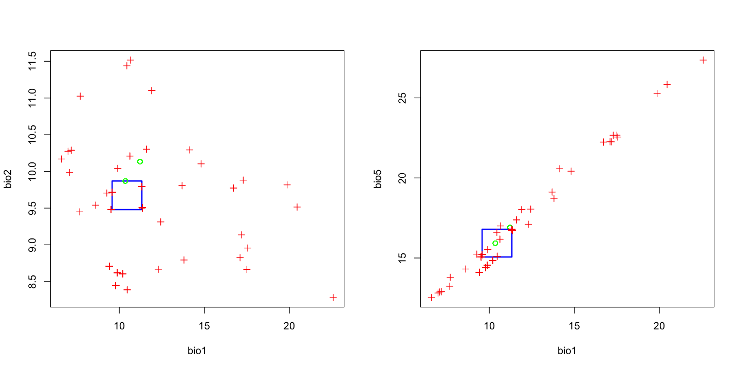
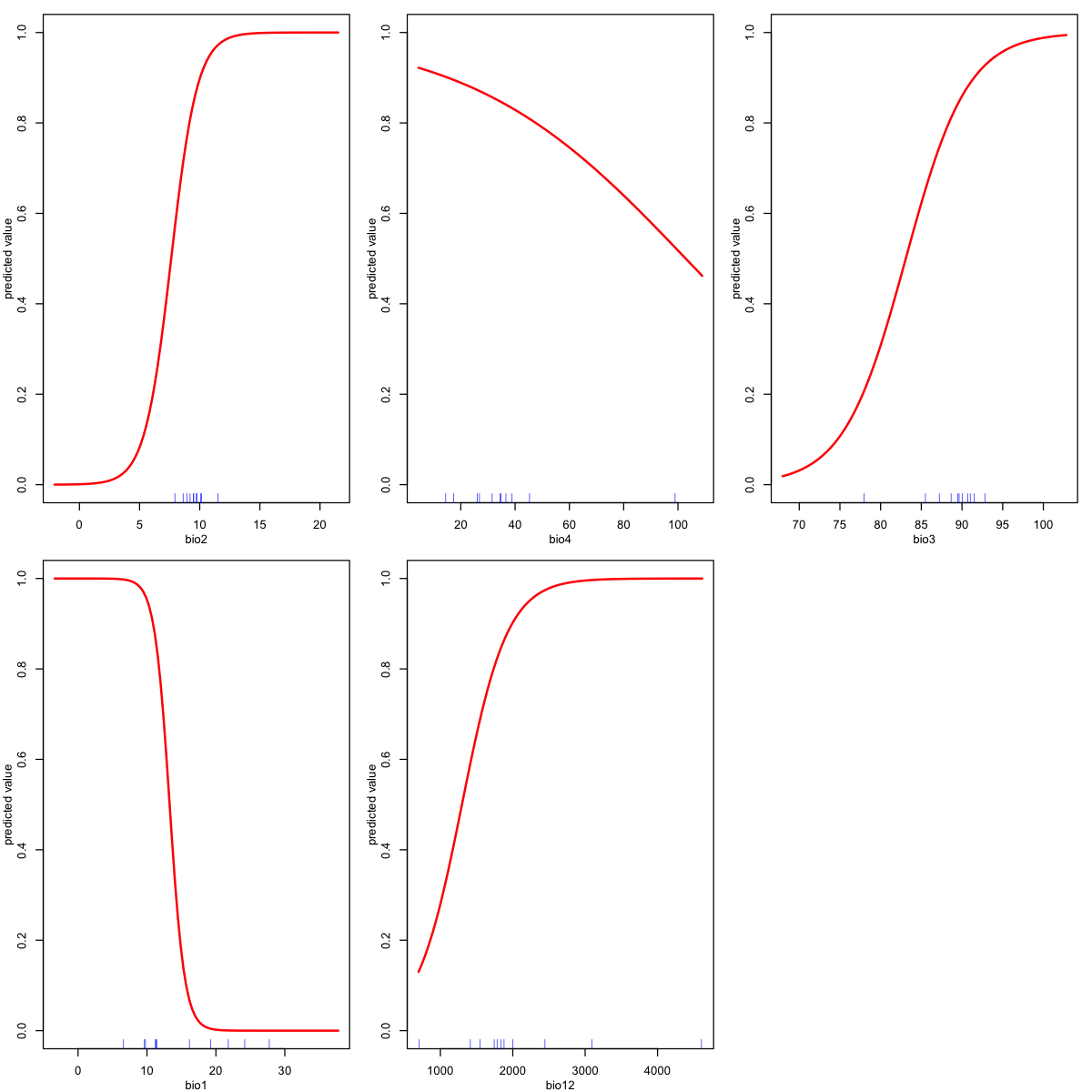
In that second plot, note that these two variables (mean annual temperature BIO1 and
maximum temperature of the warmest month ‘BIO5’) are extremely strongly correlated.
This is not likely to be an issue for this method, but in many models it is a very bad
idea to have strongly correlated explanatory variables: it is called
multicollinearity and can cause
serious statistical issues. We will revisit this in the GLM example further down.
Model predictions#
We’ve now fitted our model and can use the model parameters to predict the bioclim
score for the whole map. Note that a lot of the map has a score of zero: none of the
environmental variables in these cells fall within the range seen in the occupied cells.
bioclim_pred <- predict(bioclim_hist_local, bioclim_model)

# Create a copy removing zero scores to focus on within envelope locations
bioclim_non_zero <- bioclim_pred
bioclim_non_zero[bioclim_non_zero == 0] <- NA
plot(land, col='grey', legend=FALSE)
plot(bioclim_non_zero, col=hcl.colors(20, palette='Blue-Red'), add=TRUE)

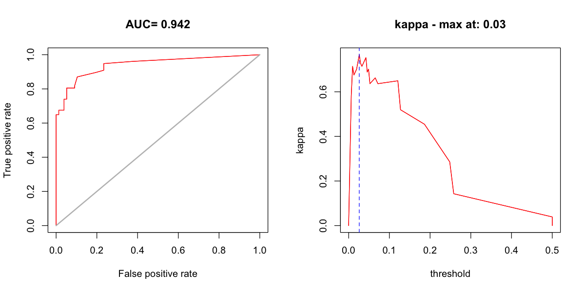
Model evaluation#
We can also now evaluate our model using the retained test data. Note that here, we do
have to provide absence data: all of the standard performance metrics come from a
confusion matrix, which requires false and true negatives. The output of evaluate
gives us some key statistics, including AUC.
test_locs <- st_coordinates(subset(tapir_GBIF, kfold == 1))
test_pseudo <- st_coordinates(subset(pseudo_nearby, kfold == 1))
bioclim_eval <- evaluate(p=test_locs, a=test_pseudo,
                         model=bioclim_model, x=bioclim_hist_local)
print(bioclim_eval)
class          : ModelEvaluation
n presences    : 77
n absences     : 77
AUC            : 0.9417271
cor            : 0.6547355
max TPR+TNR at : 0.02604379
We can also create some standard plots. One plot is the ROC curve and the other is a
graph of how kappa changes as the threshold used on the model predictions varies. The
threshold function allows us to find an optimal threshold for a particular measure of
performance: here we find the threshold that gives the best kappa.
par(mfrow=c(1,2))

# Plot the ROC curve
plot(bioclim_eval, 'ROC', type='l')

# Find the maximum kappa and show how kappa changes with the model threshold
max_kappa <- threshold(bioclim_eval, stat='kappa')
plot(bioclim_eval, 'kappa', type='l')
abline(v=max_kappa, lty=2, col='blue')
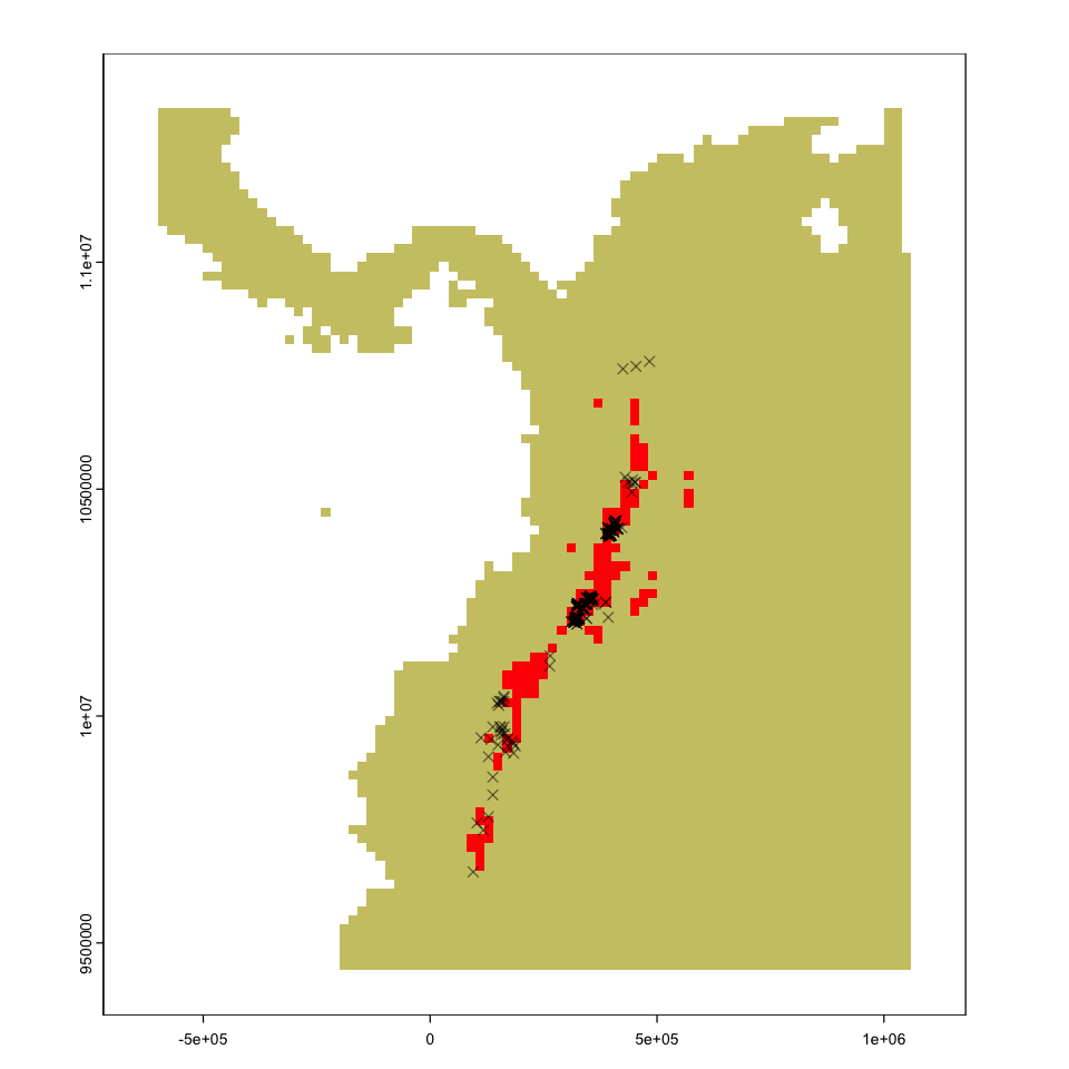
Species distribution#
That gives us all the information we need to make a prediction about the species distribution:
# Apply the threshold to the model predictions
tapir_range <- bioclim_pred >= max_kappa
plot(tapir_range, legend=FALSE, col=c('khaki3','red'))
plot(st_geometry(tapir_GBIF), add=TRUE, pch=4, col='#00000088')
Future distribution of the tapir
The figure below shows the predicted distribution of the Mountain Tapir in 2050 and the predicted range change - can you figure out how to create these plots?
Show code cell source
# Predict from the same model but using the future data
bioclim_pred_future <- predict(bioclim_future_local, bioclim_model)
# Apply the same threshold
tapir_range_future <- bioclim_pred_future >= max_kappa

par(mfrow=c(1,3), mar=c(2,2,1,1))
plot(tapir_range, legend=FALSE, col=c('grey','red'))
plot(tapir_range_future, legend=FALSE, col=c('grey','red'))

# This is a bit of a hack - adding 2 * hist + 2050 gives:
# 0 + 0 - present in neither model
# 0 + 1 - only in future
# 2 + 0 - only in hist
# 2 + 1 - in both
tapir_change <- 2 * (tapir_range) + tapir_range_future
cols <- c('lightgrey', 'blue', 'red', 'forestgreen')

plot(tapir_change, col=cols, legend=FALSE)
legend(-6e5, 1.14e7, fill=cols,
       legend=c('Absent','Future','Historical', 'Both'),
       bg='white')

Generalised Linear Model (GLM)#
We are going to jump the gun a bit here and use a GLM. You will cover the statistical background for this later in the course, but essentially it is a kind of regression that allows us to model presence/absence as a binary response variable more appropriately. Do not worry about the statistical details here: we will treat this as just another algorithm for predicting species presence. You will learn about GLMs later in more theoretical depth - they are hugely useful.
Data restructuring#
The bioclim model allowed us just to provide points and some maps but many other
distribution models require us to use a model formula, as you saw last week with
linear models. So we need to restructure our data into a data frame of species
presence/absence and the environmental values observed at the locations of those
observations.
First, we need to combine tapir_GBIF and pseudo_nearby into a single data frame:
# Create a single sf object holding presence and pseudo-absence data.
# - reduce the GBIF data and pseudo-absence to just kfold and a presence-absence value
present <- subset(tapir_GBIF, select='kfold')
present$pa <- 1
absent <- pseudo_nearby
absent$pa <- 0

# - rename the geometry column of absent to match so we can stack them together.
names(absent) <- c('geometry','kfold','pa')
st_geometry(absent) <- 'geometry'

# - stack the two dataframes
pa_data <- rbind(present, absent)
print(pa_data)
Simple feature collection with 766 features and 2 fields
Geometry type: POINT
Dimension:     XY
Bounding box:  xmin: -3040.424 ymin: 9566429 xmax: 577946.5 ymax: 10873630
Projected CRS: WGS 84 / UTM zone 18S
First 10 features:
   kfold pa                  geometry
1      2  1    POINT (149798 9936513)
3      1  1  POINT (156685.1 9964925)
7      5  1  POINT (134253.4 9948230)
8      3  1 POINT (429786.7 10526533)
9      5  1 POINT (436714.8 10515131)
10     5  1    POINT (163066 9976153)
11     4  1 POINT (148013.6 10028318)
12     1  1 POINT (152531.1 10032452)
13     4  1 POINT (155490.2 10031935)
14     1  1 POINT (157889.8 10032259)
Second, we need to extract the environmental values for each of those points and add it into the data frame.
envt_data <- extract(bioclim_hist_local, pa_data)
pa_data <- cbind(pa_data, envt_data)
print(pa_data)
Simple feature collection with 766 features and 22 fields
Geometry type: POINT
Dimension:     XY
Bounding box:  xmin: -3040.424 ymin: 9566429 xmax: 577946.5 ymax: 10873630
Projected CRS: WGS 84 / UTM zone 18S
First 10 features:
   kfold pa ID      bio1      bio2     bio3     bio4     bio5      bio6
1      2  1  1  7.072452  9.984288 85.62547 51.81070 12.87623  1.217051
3      1  1  2  7.172537 10.287475 88.36607 42.57916 12.89965  1.263602
7      5  1  3  7.705094 11.024811 89.50469 34.83894 13.79287  1.483661
8      3  1  4 17.549557  8.956165 90.82992 30.61368 22.55479 12.695293
9      5  1  5 17.184124  9.135429 91.14763 30.10217 22.25498 12.229358
10     5  1  6  9.911862 10.040993 88.04670 42.08802 15.52201  4.118061
11     4  1  7 11.909942 11.100656 89.72603 20.09789 18.01456  5.639944
12     1  1  8 11.909942 11.100656 89.72603 20.09789 18.01456  5.639944
13     4  1  9 11.909942 11.100656 89.72603 20.09789 18.01456  5.639944
14     1  1 10 11.909942 11.100656 89.72603 20.09789 18.01456  5.639944
        bio7      bio8      bio9     bio10     bio11     bio12    bio13
1  11.659174  6.945419  7.117470  7.476185  6.322656 1205.8021 129.4123
3  11.636047  7.018712  7.210472  7.502191  6.549582 1095.5497 113.3282
7  12.309209  7.926650  7.221262  7.996713  7.211689 1051.8979 118.3754
8   9.859499 17.155876 17.670612 17.807304 17.129913 2077.0840 274.6361
9  10.025620 16.788065 17.290207 17.438137 16.774698 1990.4896 271.0140
10 11.403954  9.624750 10.131989 10.234146  9.283476 1352.6167 139.6942
11 12.374614 12.014458 11.688684 12.094175 11.629616  910.8334 115.2923
12 12.374614 12.014458 11.688684 12.094175 11.629616  910.8334 115.2923
13 12.374614 12.014458 11.688684 12.094175 11.629616  910.8334 115.2923
14 12.374614 12.014458 11.688684 12.094175 11.629616  910.8334 115.2923
      bio14    bio15    bio16    bio17    bio18    bio19
1  72.38869 17.88721 358.7333 243.3271 264.1544 336.3893
3  63.92614 17.96897 321.5514 222.6898 275.2428 261.9020
7  47.91859 25.76174 328.2612 174.3829 295.5194 186.1409
8  96.13687 32.00084 665.4611 344.6609 524.6337 654.7625
9  84.48708 33.31814 648.4445 316.8311 531.4911 645.6810
10 82.15632 16.78157 403.4734 273.3031 294.5077 378.3570
11 33.00918 34.87483 305.4091 122.6687 294.7859 138.5003
12 33.00918 34.87483 305.4091 122.6687 294.7859 138.5003
13 33.00918 34.87483 305.4091 122.6687 294.7859 138.5003
14 33.00918 34.87483 305.4091 122.6687 294.7859 138.5003
                    geometry
1     POINT (149798 9936513)
3   POINT (156685.1 9964925)
7   POINT (134253.4 9948230)
8  POINT (429786.7 10526533)
9  POINT (436714.8 10515131)
10    POINT (163066 9976153)
11 POINT (148013.6 10028318)
12 POINT (152531.1 10032452)
13 POINT (155490.2 10031935)
14 POINT (157889.8 10032259)
Fitting the GLM#
We can now fit the GLM using a model formula: the family=binomial(link = "logit") is
the change that allows us to model binary data better, but we do not need the gory
details here.
Three things you do need to know:
The number of bioclim variables has been reduced from the full set of 19 down to five. This is because of the issue of multicollinearity - some pairs of
bioclimvariables are very strongly correlated. The five variables are chosen to represent related groups of variables (show me how!).The
subsetargument is used to hold back one of thekfoldpartitions for testing.The
predictmethod for a GLM needs an extra argument (type='response') to make it give us predictions as the probability of species occurence. The default model prediction output (?predict.glm) is on the scale of the linear predictors - do not worry about what this means now, but note that there are a few places where we need to make this change from the default.
The model fitting code is:
glm_model <- glm(pa ~ bio2 + bio4 + bio3 + bio1 + bio12, data=pa_data,
                 family=binomial(link = "logit"),
                 subset=kfold != 1)
Using a GLM gives us the significance of different variables - this table is very similar to a linear model summary. It is interpreted in much the same way.
# Look at the variable significances - which are important
summary(glm_model)
Call:
glm(formula = pa ~ bio2 + bio4 + bio3 + bio1 + bio12, family = binomial(link = "logit"),
    data = pa_data, subset = kfold != 1)

Coefficients:
              Estimate Std. Error z value Pr(>|z|)
(Intercept) -2.498e+01  1.362e+01  -1.833  0.06673 .
bio2         9.160e-01  3.022e-01   3.031  0.00244 **
bio4        -2.509e-02  2.904e-02  -0.864  0.38753
bio3         2.619e-01  1.469e-01   1.783  0.07459 .
bio1        -9.168e-01  9.234e-02  -9.929  < 2e-16 ***
bio12        3.171e-03  5.198e-04   6.101 1.06e-09 ***
---
Signif. codes:  0 ‘***’ 0.001 ‘**’ 0.01 ‘*’ 0.05 ‘.’ 0.1 ‘ ’ 1

(Dispersion parameter for binomial family taken to be 1)

    Null deviance: 848.41  on 611  degrees of freedom
Residual deviance: 249.32  on 606  degrees of freedom
AIC: 261.32

Number of Fisher Scoring iterations: 7
It can also be helpful to look at response plots: these show how the probability of a species being present changes with a given variable. These are predictions for each variable in turn, holding all the other variables at their median value.
# Response plots
par(mar=c(3,3,1,1), mgp=c(2,1,0))
response(glm_model, fun=function(x, y, ...) predict(x, y, type='response', ...))
Model predictions and evaluation#
We can now evaluate our model using the same techniques as before:
Create a prediction layer.
glm_pred <- predict(bioclim_hist_local, glm_model, type='response')
Evaluate the model using the test data.
# Extract the test presence and absence
test_present <- st_coordinates(subset(pa_data, pa == 1 & kfold == 1))
test_absent <- st_coordinates(subset(pa_data, pa == 0 & kfold == 1))
glm_eval <- evaluate(p=test_present, a=test_absent, model=glm_model,
x=bioclim_hist_local)
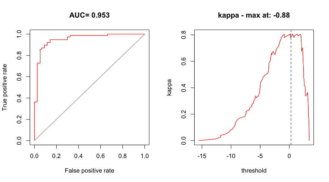
print(glm_eval)
class          : ModelEvaluation
n presences    : 77
n absences     : 77
AUC            : 0.9532805
cor            : 0.7584837
max TPR+TNR at : -0.8815735
Find the maximum kappa threshold. This is a little more complicated than before the threshold we get is again on the scale of the linear predictor. For this kind of GLM, we can use
plogisto convert back.
max_kappa <- plogis(threshold(glm_eval, stat='kappa'))
print(max_kappa)
[1] 0.2928518
Look at some model performance plots
par(mfrow=c(1,2))
# ROC curve and kappa by model threshold
plot(glm_eval, 'ROC', type='l')
plot(glm_eval, 'kappa', type='l')
abline(v=max_kappa, lty=2, col='blue')
Species distribution from GLM#
We can now again use the threshold to convert the model outputs into a predicted species’ distribution map and compare current suitability to future suitability.
par(mfrow=c(2,2))

# Modelled probability
plot(glm_pred, col=hcl.colors(20, 'Blue-Red'))

# Threshold map
glm_map <- glm_pred >= max_kappa
plot(glm_map, legend=FALSE, col=c('grey','red'))

# Future predictions
glm_pred_future <- predict(bioclim_future_local, glm_model, type='response')
plot(glm_pred_future, col=hcl.colors(20, 'Blue-Red'))

# Threshold map
glm_map_future <- glm_pred_future >= max_kappa
plot(glm_map_future, legend=FALSE, col=c('grey','red'))
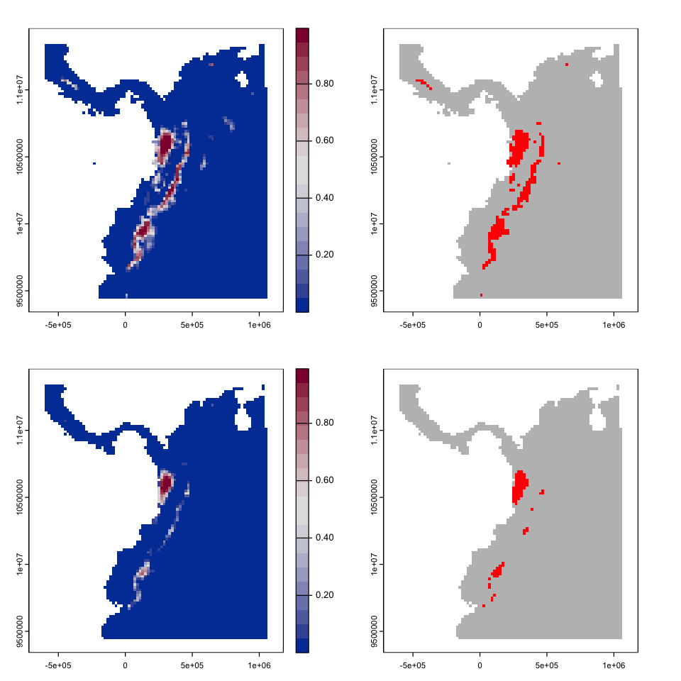
One simple way to describe the modelled changes is simply to look at a table of the pair of model predictions:
table(values(glm_map), values(glm_map_future), dnn=c('hist', '2050'))
       2050
hist    FALSE TRUE
  FALSE  4247    0
  TRUE    137   77
This GLM predicts a significant loss of existing range for this species by 2041 - 2060 and no expansion into new areas.
Sandbox - things to try with SDMs#
The previous sections have introduced the main approaches for fitting and assessing models so the following sections are intended to give you some things to try. You do not have to try all of them in the practical - pick things that interest you and give them a go.
One of the things to take away from these options are that SDMs have an extremely wide range of options, so testing and comparing many approaches is vital to identifying the features of model predictions that are comparable.
Modelling a different species#
The environmental data is global, so we can use it to model any terrestrial organism for which we can get location data. So:
Have a look at the GBIF species data page and pick a species you would like to model. It probably makes sense to pick something with a relatively limited range.
You can the easily get the recorded points using the
dismofunctiongbif. The example below gets the data for the Mountain Tapir direct from GBIF. It is worth running the command withdownload=FALSEfirst to get an idea of the number of records you will get - pick a species that has a few thousand at most.
# Check the species without downloading - this shows the number of records
gbif('Tapirus', 'pinchaque', download=FALSE)
# Download the data
locs <- gbif('Tapirus', 'pinchaque')
locs <- subset(locs, ! is.na(lat) | ! is.na(lon))
# Convert to an sf object
locs <- st_as_sf(locs, coords=c('lon', 'lat'))
You will then need to clean the GBIF points - have a look at the
sdmvignette mentioned above for ways to tackle cleaning the data. One tip - check thebasisOfRecordfield because the GBIF occurence database includes things like the location of museum specimens. It is much harder to identify species introductions though.Select an appropriate extent for the modelling and update
model_extent.Follow the process above to create your model.
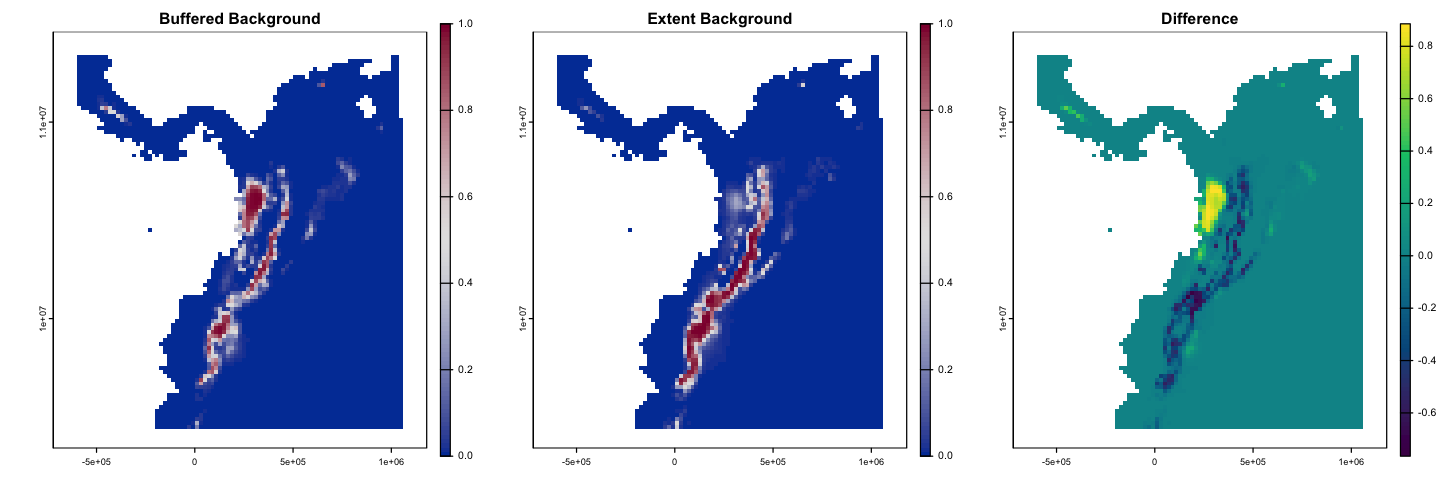
Does our background choice matter?#
The examples above have used the spatially structured background data. Does this matter?
The plot below compares the GLM fitted with the structured background to the wider
sample created using randomPoints. Can you create this model?
Show code cell source
# 1. Create the new dataset
present <- subset(tapir_GBIF, select='kfold')
present$pa <- 1
absent <- pseudo_dismo
absent$pa <- 0

# - rename the geometry column of absent to match so we can stack them together.
names(absent) <- c('geometry','kfold','pa')
st_geometry(absent) <- 'geometry'
# - stack the two dataframes
pa_data_bg2 <- rbind(present, absent)
# - Add the envt.
envt_data <- extract(bioclim_hist_local, pa_data_bg2)
pa_data_bg2 <- cbind(pa_data_bg2, envt_data)

# 2. Fit the model
glm_model_bg2 <-glm(pa ~ bio2 + bio4 + bio3 + bio1 + bio12, data=pa_data_bg2,
                  family=binomial(link = "logit"),
                  subset=kfold != 1)

# 3. New predictions
glm_pred_bg2 <- predict(bioclim_hist_local, glm_model_bg2, type='response')

# 4. Plot modelled probability using the same colour scheme and using
# axis args to keep a nice simple axis on the legend
par(mfrow=c(1,3))
bks <- seq(0, 1, by=0.01)
cols <- hcl.colors(100, 'Blue-Red')
plot(glm_pred, col=cols, breaks=bks, main='Buffered Background',
     type='continuous', plg=list(ext=c(1.25e6, 1.3e6, 9.3e6, 11.5e6)))
plot(glm_pred_bg2, col=cols, breaks=bks, main='Extent Background',
     type='continuous', plg=list(ext=c(1.25e6, 1.3e6, 9.3e6, 11.5e6)))
plot(glm_pred - glm_pred_bg2, col= hcl.colors(100), main='Difference',
     type='continuous', plg=list(ext=c(1.25e6, 1.3e6, 9.3e6, 11.5e6)))
Cross validation#
Attention
This exercise calls for more programming skills - you need to be able to write a loop and set up object to store data for each iteration through the loop.
The models above always use the same partitions for testing and training. A better approach is to perform k-fold cross validation to check that the model behavour is consistent across different partitions. This allows you to compare the performance of models taking into account the arbitrary structure of the partitioning.
Here, we have used a completely random partition of the data, but it is worth looking at this recent paper arguing for a spatially structured approach to data partitions in SDM testing:
Valavi, R, Elith, J, Lahoz‐Monfort, JJ, Guillera‐Arroita, G. blockCV: An r package for generating spatially or environmentally separated folds for k‐fold cross‐validation of species distribution models. Methods Ecol Evol. 2019; 10: 225– 232. https://doi.org/10.1111/2041-210X.13107
Try and create the output below, collecting the ROC lines and AUCs across all five possible test partitions of the GLM model. There are two things here that are more difficult:
A way to get the ROC data from the output of
evaluate- this is not obvious becausedismouses a different coding approach (S4 methods) that is a bit more obscure. Don’t worry about this - just use the function! Similarly, you need to know that to get the AUC value, you need to useglm_eval@auc.
get_roc_data <- function(eval){
    #' get_roc_data
    #'
    #' This is a function to return a dataframe of true positive
    #' rate and false positive rate from a dismo evalulate output
    #'
    #' @param eval An object create by `evaluate` (S4 class ModelEvaluation)

    roc <- data.frame(FPR = eval@FPR, TPR = eval@TPR)
    return(roc)
}
You want each model evaluation to be carried out using the same threshold breakpoints, otherwise it is difficult to align the outputs of the different partitions. We can give
evaluatea set of breakpoints but - for the GLM - the breakpoints are on that mysterious scale of the linear predictors. The following approach allows you to set those breakpoints.
# Take a sequence of probability values from 0 to 1
thresholds <- seq(0, 1, by=0.01)
# Convert to the default scale for a binomial GLM
thresholds <- qlogis(thresholds)
# Use in evaluate
eval <- evaluate(p=test_present, a=test_absent, model=glm_model,
                  x=bioclim_hist_local, tr=thresholds)
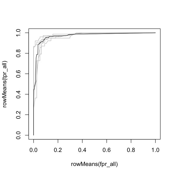
The ouputs below show the AUC and ROC curve for each of the \(k\)-fold partitions and the average across partitions. See if you can calculate these!
Show code cell source
# Make some objects to store the data
tpr_all <- matrix(ncol=5, nrow=length(thresholds))
fpr_all <- matrix(ncol=5, nrow=length(thresholds))
auc <- numeric(length=5)

# Loop over the values 1 to 5
for (test_partition in 1:5) {

    # Fit the model, holding back this test partition
    model <- glm(pa ~ bio2 + bio4 + bio3 + bio1 + bio12, data=pa_data,
                 family=binomial(link = "logit"),
                 subset=kfold != test_partition)

    # Evaluate the model using the retained partition
    test_present <- st_coordinates(subset(pa_data, pa == 1 & kfold == test_partition))
    test_absent <- st_coordinates(subset(pa_data, pa == 0 & kfold == test_partition))
    eval <- evaluate(p=test_present, a=test_absent, model=glm_model,
                     x=bioclim_hist_local, tr=thresholds)

    # Store the data
    auc[test_partition] <- eval@auc
    roc <- get_roc_data(eval)
    tpr_all[,test_partition] <- roc$TPR
    fpr_all[,test_partition] <- roc$FPR
}

# Create a blank plot to showing the mean ROC and the individual traces
plot(rowMeans(fpr_all), rowMeans(tpr_all), type='n')

# Add the individual lines
for (test_partition in 1:5) {
  lines(fpr_all[, test_partition], tpr_all[, test_partition], col='grey')
}

# Add the mean line
lines(rowMeans(fpr_all), rowMeans(tpr_all))

print(auc)
print(mean(auc))
[1] 0.9532805 0.9894391 0.9634002 0.9814751 0.9691348
[1] 0.9713459
Reducing the set of variables#
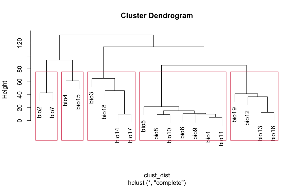
The details of this selection process are hidden below. I’m using clustering to find groups - you do not need to look at this but I do not like hiding my working!
# We can use the values from the environmental data in a cluster algorithm.
# This is a statistical process that groups sets of values by their similarity
# and here we are using the local raster data (to get a good local sample of the
# data correlation) to perform that clustering.
clust_data <- values(bioclim_hist_local)
clust_data <- na.omit(clust_data)

# Scale and center the data
clust_data <- scale(clust_data)

# Transpose the data matrix to give variables as rows
clust_data <- t(clust_data)

# Find the distance between variables and cluster
clust_dist <- dist(clust_data)
clust_output <- hclust(clust_dist)
plot(clust_output)

# And then pick one from each of five blocks - haphazardly.
rect.hclust(clust_output, k=5)